Campfire Social is an Atlanta-based digital marketing company.
The Brief
Campfire’s goal was to fully transform their branding into something versatile and filled with personality.
Handing off their logomark and a few base colors, they allowed me to run wild, bringing analog design into their identity that updates their 2017 wanderlust vibe to something rooted in retro campsite design that will stand the test of time.
Client
Campfire Social
Year
2022
Deliverables
Moodboard
Color palette
Secondary marks
Font pack
Stamps & Badges
Patterns
Identity Design
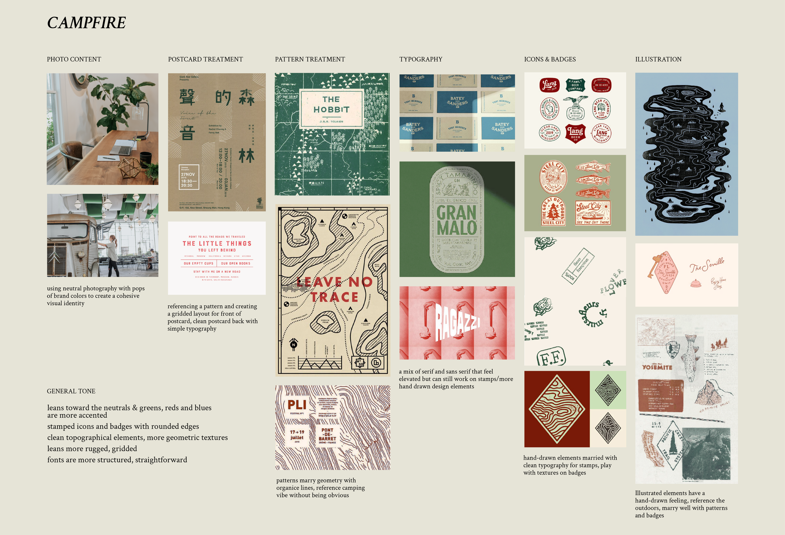
Creating a succinct moodboard guides my process, from selecting the right colors to complement the existing project. I presented 2 concepts to Campfire, weaving their brand photography in with inspo for different elements of their identity.
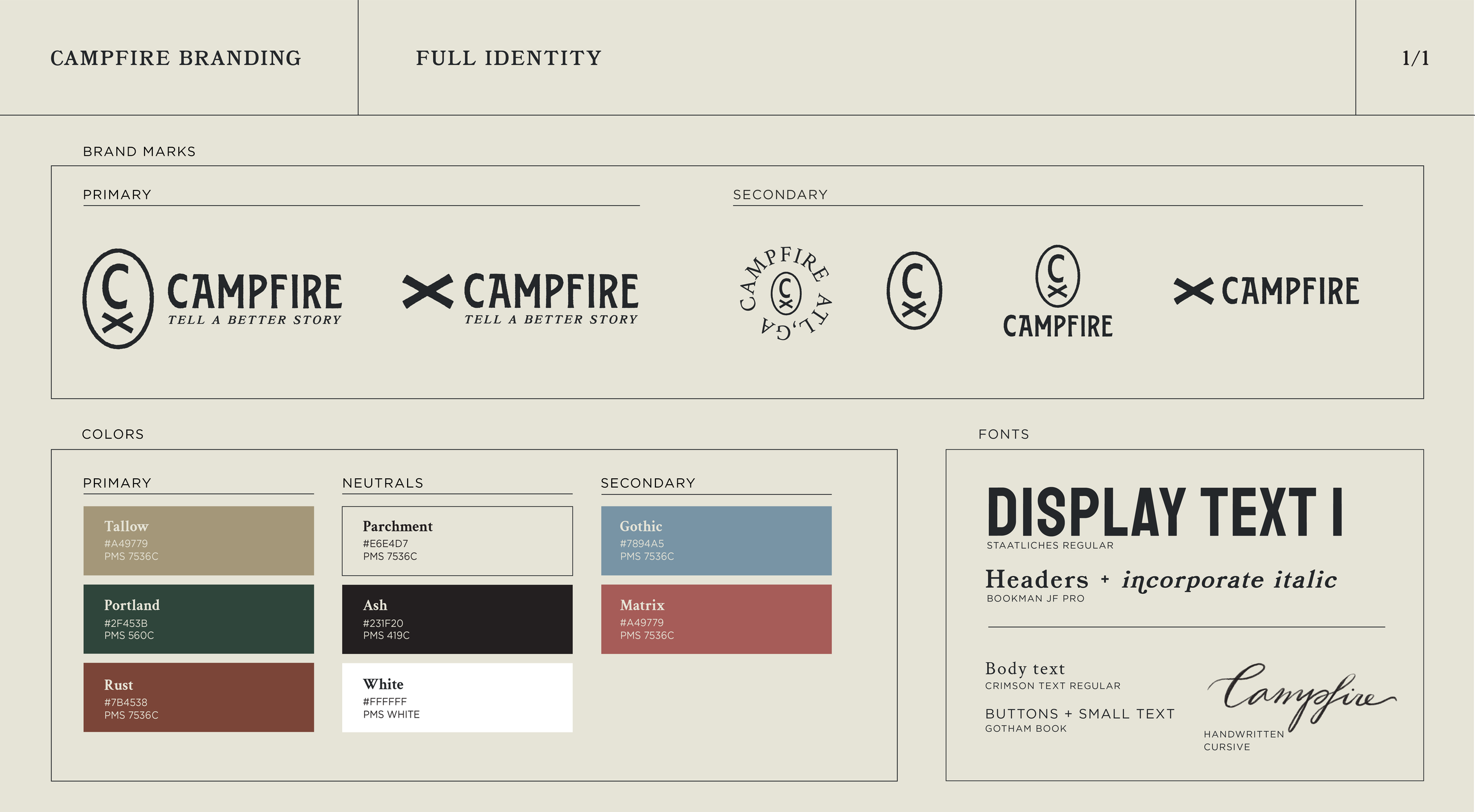
I then rounded up their brand marks, adding a few secondary marks to their lineup, updated their color palette with a few additional secondary colors, and revamped their font pack.
Print and pattern design
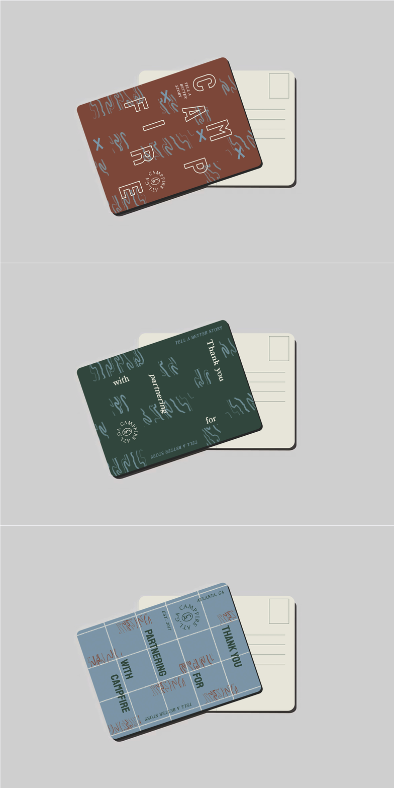
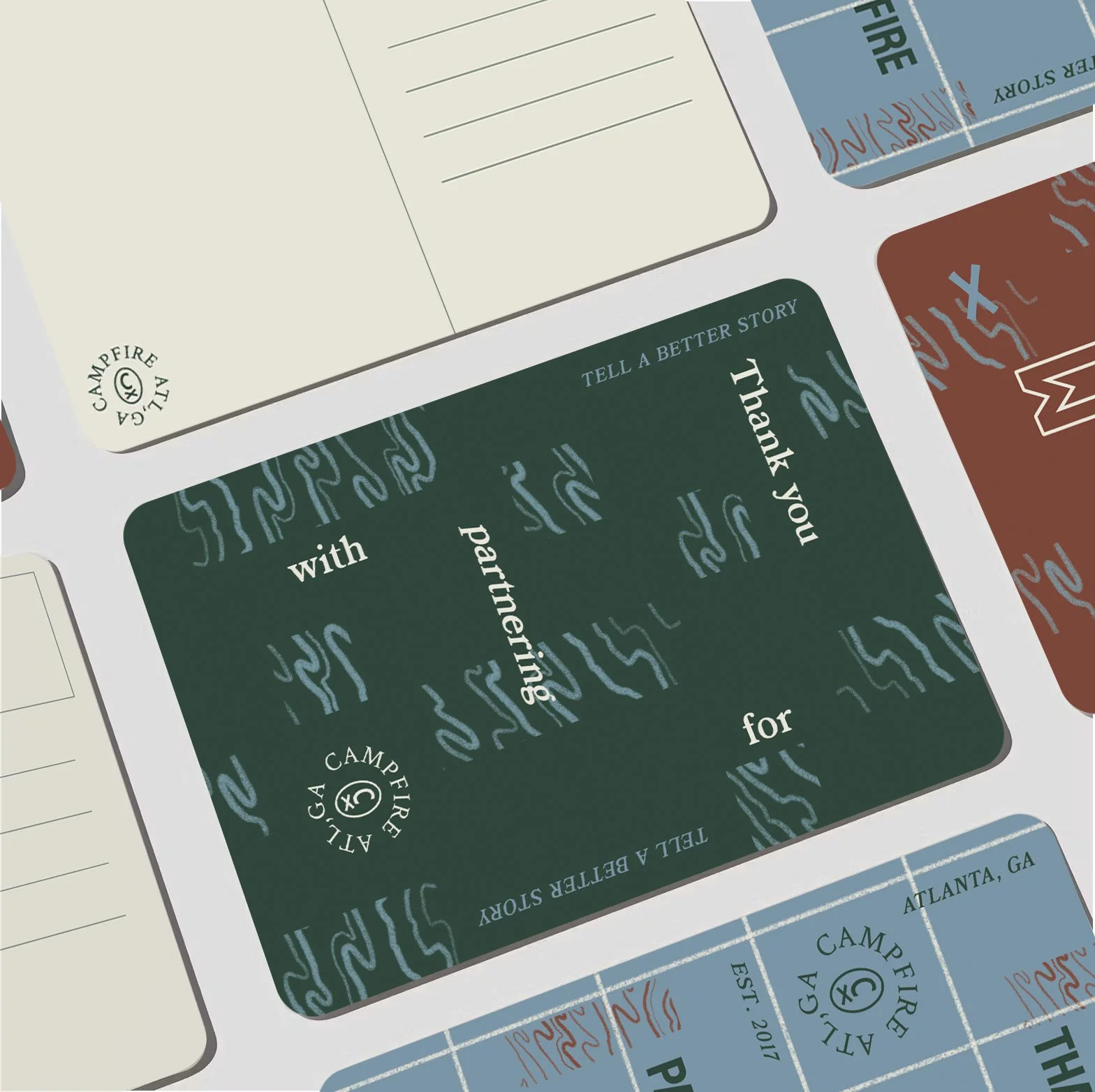
Campfire also wanted to create a keepsake for clients and a means to leave a memorable thank you. The postcard is a versatile way to leave an impression and jives well with the vintage camping elements of Campfire’s new identity.
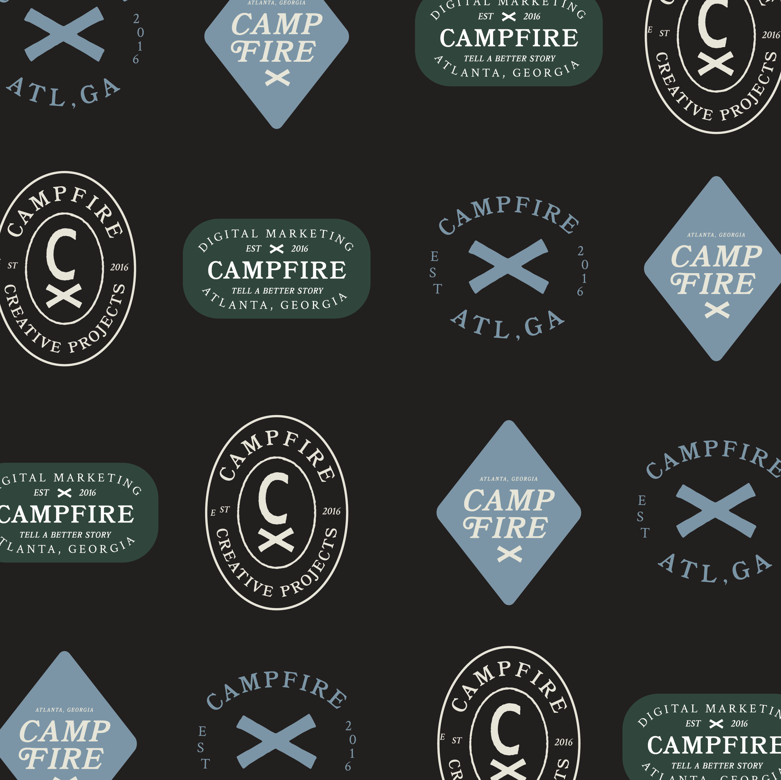
I am naturally drawn to the loose and illustrative details that can make a brand memorable. Patterns, badges, and stamps were requested by the client to add warmth to the identity.
Postcard design layout
Pattern 01
Badges
Stamps
Pattern 02


