Nothing to See Here explored how we as the viewer and the artist as the creator assign meaning to abstract artwork.
The Brief
My capstone project of college, this project was primarily a research project, and I treated it as such. The design could only follow hours in the library and the synthesis of many books, articles, and interviews.
My goal was to research the relationship between abstract artwork and the meaning it is assigned. I zeroed in on both the perspectives of artists and viewers, interviewing and reading from both camps. I then brought all ideas together through the designs of 2 posters and 2 booklets.
Deliverables
Posters I and II
Books I and II
Printed exhibition
Project
Nothing to See Here
Year
2021
-
Content Research
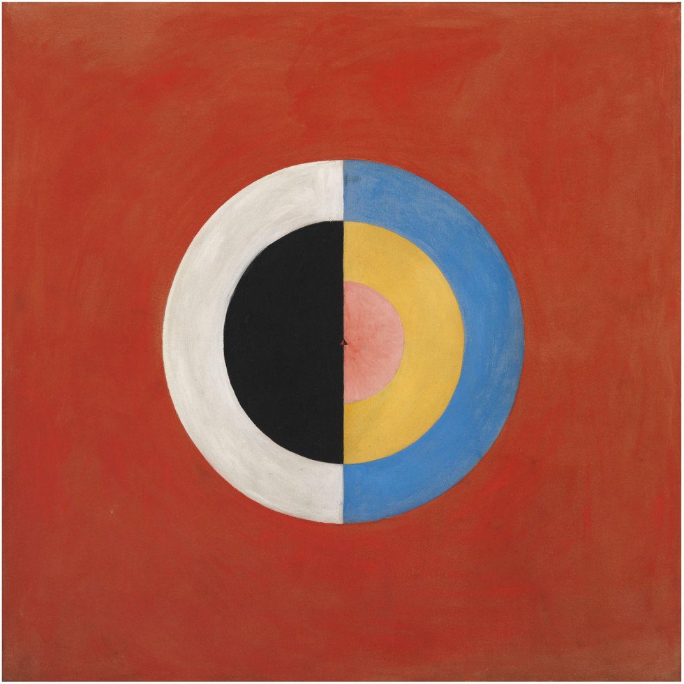
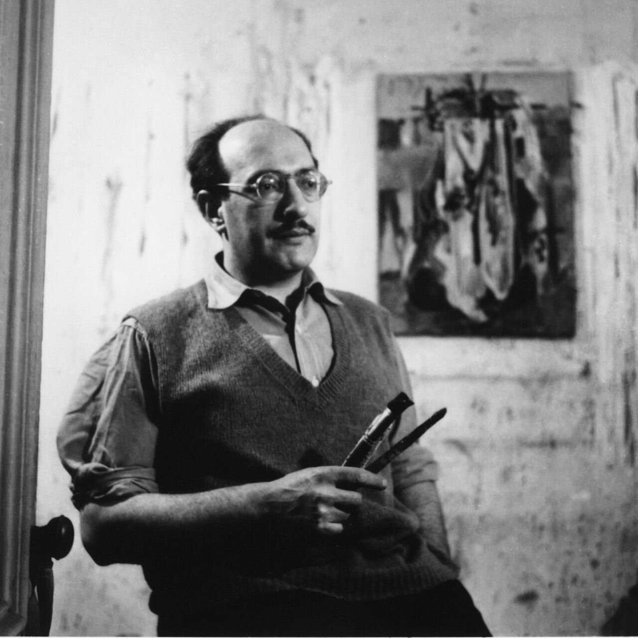
Traditionally incorporating pre-written text into design systems; I do not typically add the word “content” to my self-assigned title of “creator.” Therefore, to supplement my unfamiliarity with writing content, I dove into research, evaluating the writings and paintings of Kandinsky and Rothko and reading texts from Teki and Ramachandran, exploring how the brain processes the elements of abstract art.

-
Outsourcing
I didn’t want to solely research written texts and journals; I was tackling an academic subject that was also inherently subjective and personal. I interviewed two research librarians, three painting students, and an art history professor, in order to glean multiple perspectives on the sequence and quality of my research. Though my goal was objectivity, I couldn’t avoid the spectrum of opinions abstract art stirs.

-
Design Research
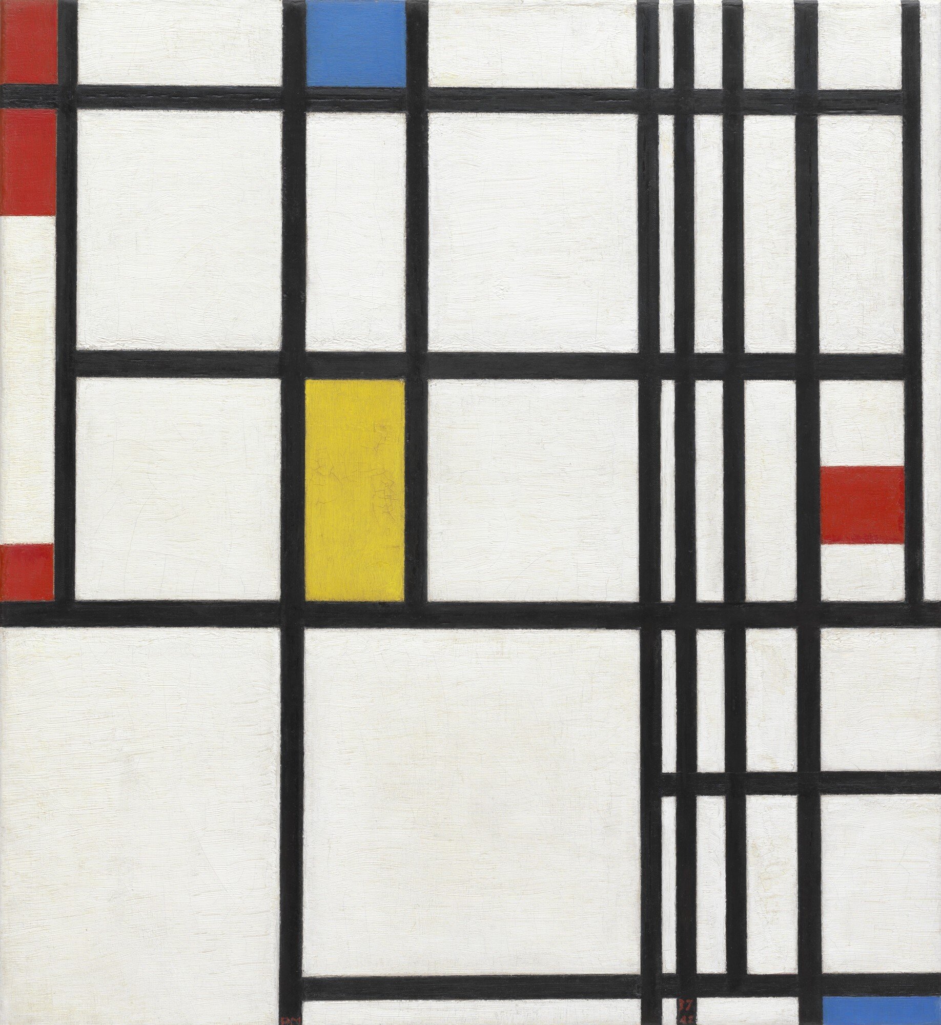
I was influenced by the clear visual hierarchy of Japanese typography and the three dimensional quality of modern design, melding those strategies with the grid of the constructivist movement. Nodding to Mondrian and Malevich allowed for organization as well as conversation between the text and the design. I also knew hand-drawn lettering would create contrasting organic lines.

To push past the aesthetic achievement of a moodboard, I hoped to curate a series of designs and works that would guide my design choices, incorporating handwritten fonts as explored in the Japanese design included in the board, and bold colors offset by black and white.
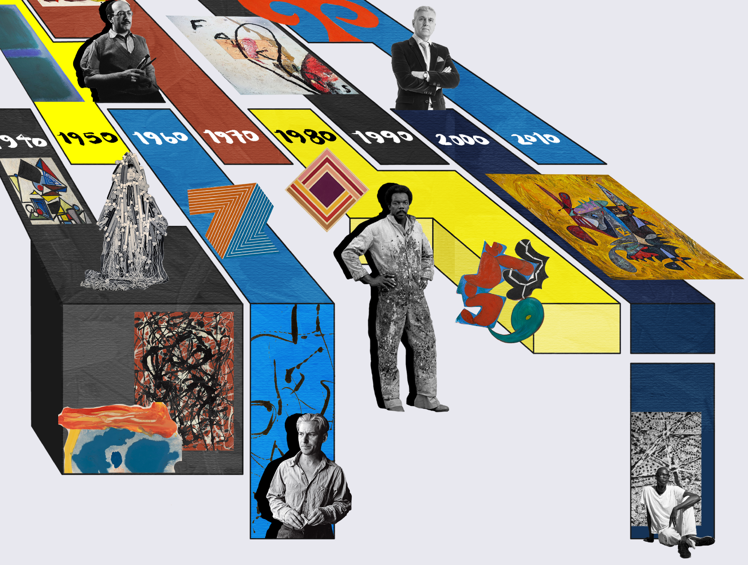
Prep work involved presenting an identity and early stage mockups to professors and peers. Below is an early stage mockup of a timeline incorporating some of the colors I experimented with. This timeline would evolve greatly past this design.
Deliverables
Once research and concept were completed I decided how to present my research: 2 posters and 2 books would work together to usher the reader into a hierarchy of content, increasing in text as they go.
Two poster designs would give the viewer a strong idea of the book content without overwhelming with written text.
Poster I presents details of famous artworks that coincide with the elements color, form, texture, and line.
Poster II also incorporates major artworks, but aims to give a clear outline of the story arch of nonrepresentational paintings: their origins, the major players in their creation, and how work stylistically changed through time. Poster II began as a traditional poster but in exhibition would become free-floating blocks as depicted below in the exhibition section.
The 2 books offered a deeper dive into the research.
Book 1 focuses on the voice of abstract artists and how they assign meaning to their work.
Book II synthesizes research about how our eyes and mind work together to process what we see as the viewer.
The exhibition
A computer screen or monitor being my typical medium, culminating my degree with a physical exhibition was a challenge.
I printed my book pages in a large format to frame my posters, reprinted my posters at almost 200% the size I expected, and painstakingly cut my timeline out piece by piece to create a free floating poster.
Exhibition
A computer screen or monitor being my typical medium in school, I discovered a love for print materials through this exhibition.
I printed my book pages in a large format to frame my posters, reprinted my posters at almost 200% the size I expected, and painstakingly cut my timeline out piece by piece to create a free floating poster. I also printed my books and bound them with canvas covers for display.


